This week my choices are not in a particular order as, while I have favorites, I can't really place them one over the other.

I like how the letters in this font look like they were made with rough brush strokes. The wobbliness of the letters hints at a darkness within the story which is delicious in the anticipation.

These letters remind me of the text that I see most often on old engravings. The letter C reminds me of a music note, though I couldn't say which one. The bits on the letters S look like stars, appropriate since Cress lives on a satellite.
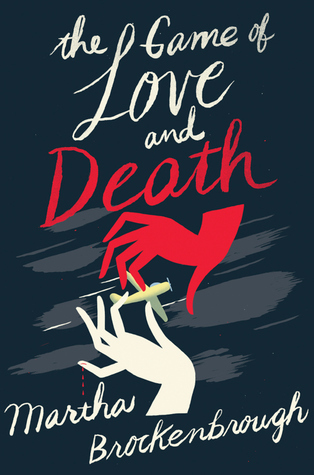
This font looks like it could be on a balance board. It is at the point where a stroke one way and it would be an elegant script; one stroke the other way and it would be ragged, like you'd expect the cloak of Death to be.
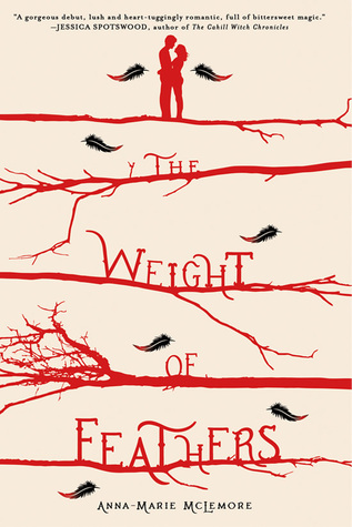
I liked this font straight away because I think that it is the kind of font that would do well on an old time advertisement for a travelling show, such as the ones that the rival families in the story operate. With a change in color, perhaps a little gold embellishment, this font on an ad might draw in anybody. As it stands though, blood red, it calls to mind the feud between the Palomas and the Corbeaus that might just cost them their lives.

Just going by the description of the story, I love its potential even more. The font goes from thick and bold to thin and barely there. It seems like it might connect with the strength of the family within the story that has lost their golden the child, the one upon whom they had pinned all their hopes.
All pictures, quotes, and videos belong to their respective owners. I use them here solely for the purpose of review and commentary.
No comments:
Post a Comment